The image gallery below showcases each step of my process of creating this drawing of Ecto 1 from the movie “Ghostbusters Afterlife.” In the movie, Ecto 1 has seen better days and I show you how I recreate the aging of the car. Click on any image to start the slide show. Each image has a description of the steps I took to ink, color, and shade Ecto 1. Enjoy!
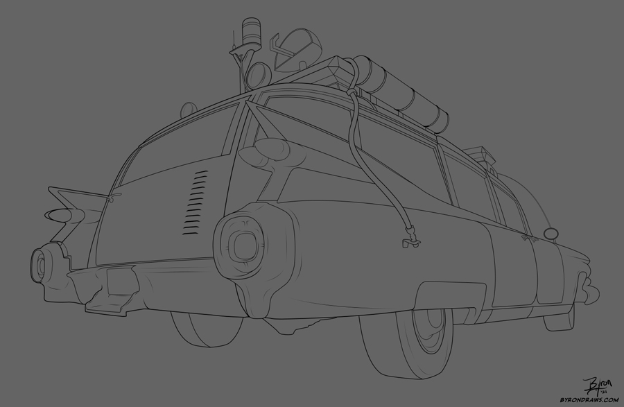
The hard part: Inking. I drew over an image I captured from a video I found on YouTube. In this case, inking over an image instead of drawing it by hand simplified the process of getting the perspective correct.
FYI: I used the drawing software Clip Studio Paint to create this image.
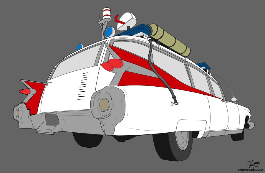
Here I’ve added in the basic flat colors. The key to recreating chrome parts is starting off with a medium gray then adding in the shadows and highlights to recreate the shiny chrome look.
I have added in the first set of lighter shades as well as the gradients for the windows. As I add in each additional layer of shades and highlights, the shape of the car becomes clearer.

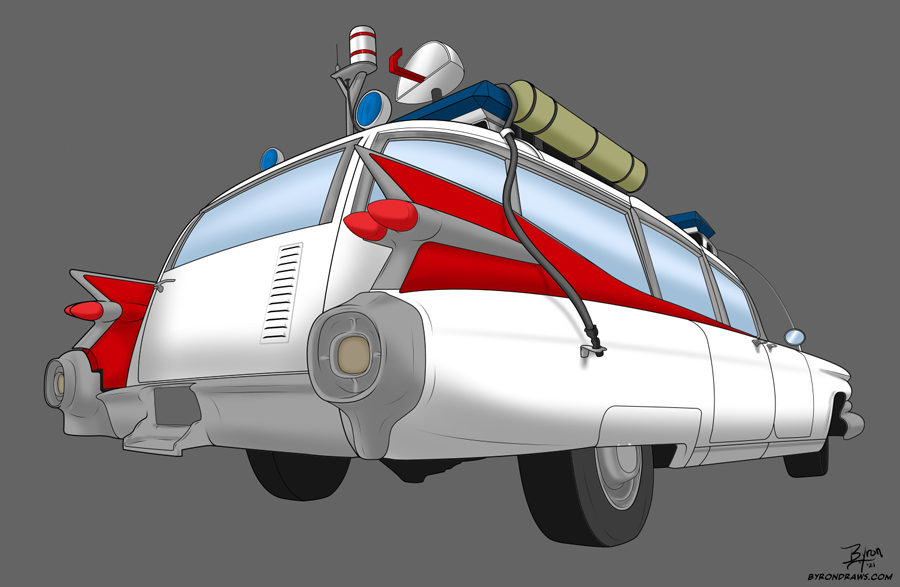
Here I’ve added in the dark shading further defining the shapes on the car.

Adding in the highlights really starts to make the car pop off the screen and look three dimensional.
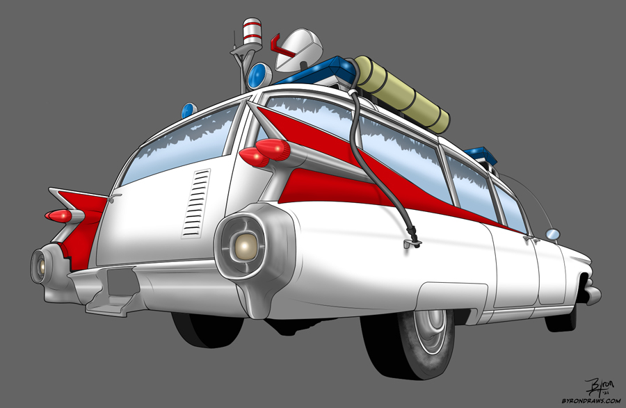
In the movie “Ghostbusters Afterlife,” the dark window tints on the rear windows has begun to deteriorate due to the car’s age. I recreated that look by using a layer reduced to 60% transparency and then using black marker tool to create the window tint shapes. I then used a hard eraser with the start reduced by 50% to make it pointy.
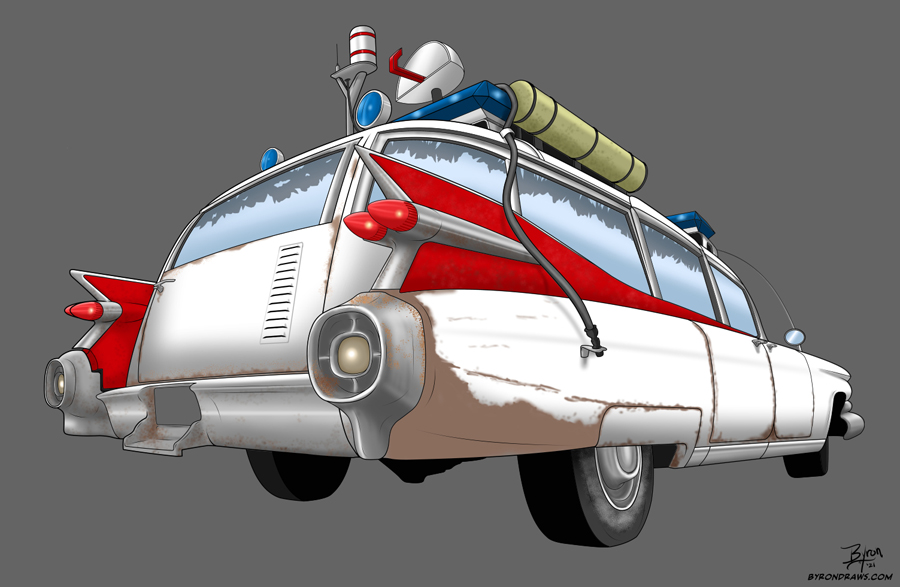
Now to make the car look old, rusted, and dirty. The first step is to add in the lighter shade of “rust” which is really just a simple brown. I used mostly an air brush tool, but did use a “splatter” tool to add in some spots and faded colors on the red fins.

I then go over the rust areas with a darker shade of brown to help define the shapes of the car. Again, a combination of the air brush and “splatter” tools were used in this step.
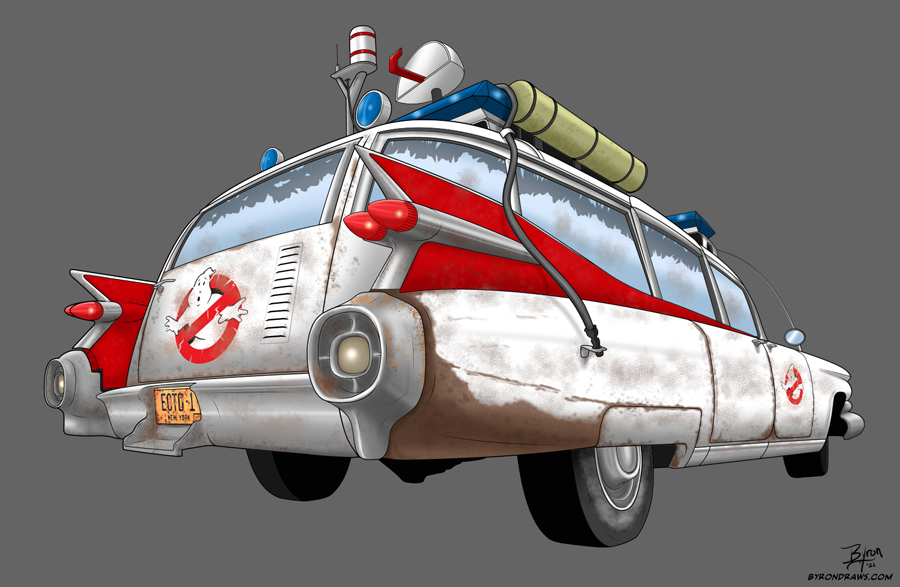
The next step was to add in the car’s logos and license plate which were obtained off the official Ghostbuster’s movie website. I first transformed the images to fit the car’s perspective angles. Then I “ripped” the logos by using a small eraser tool with the leading edge reduced by 50% to make a point out of it. This simulates the aging of the logos perfectly.
The final step was to add in one last layer of dirt over the whole car using the before mentioned “splatter” tool.
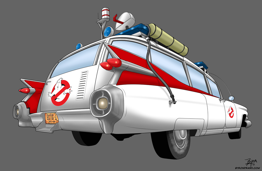
The beauty of drawing the car digitally is that I can simply turn off all of the rust and dirt layers and have a clean version of the car as well!